Audiola
Overview
Audiola is a subscription-based media service designed to cater to tech-savvy, budget-conscious users aged 18 to 24. Initially launched as a free iOS app, the platform needed to transition seamlessly into a paid model. The focus was on simplifying the subscription process, ensuring ease of use, and offering flexible payment and upgrade options to boost user adoption.
Goal
Design a user-centric subscription system that simplifies payments, enhances engagement, and drives conversions from free to premium users.
Tools
Figma
Google Form
Team
Solo

Problem
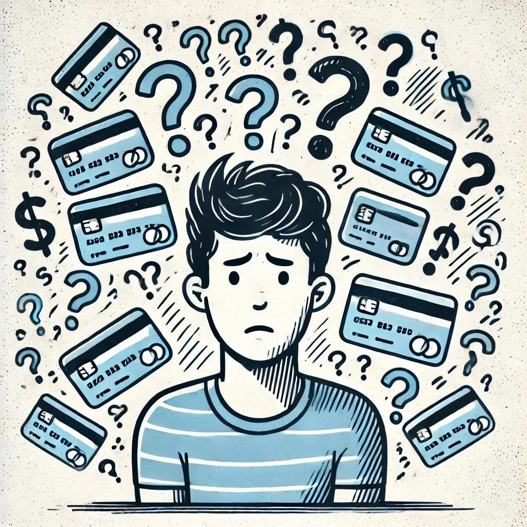
Complex Payment Options: Users found it difficult to understand and manage subscriptions.
Low Engagement: The lack of customization and user interaction discouraged conversions from free to paid plans.
Navigation Barriers: The on-boarding and upgrade processes were not intuitive, frustrating users.

Discover
Three of the most well-known music apps, Spotify, Pandora, and TIDAL, were selected for the competitive analysis.

Primary research involved designing a survey to identify user characteristics, pain points, and behaviors. The results were then used to create an affinity map, revealing common insights and trends.
Personas were developed to represent typical users.
User Flow Solution: The solution was to provide subscription and payment options both before and after the user signs up or signs in. This approach gave users the flexibility to explore plans and pricing upfront or proceed seamlessly after logging in. The flow ensured clarity, reducing friction during the subscription process.

Design Solutions
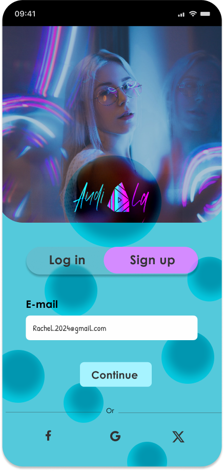
Subscription at Sign-Up: Let new users subscribe to premium during registration.
Upgrade Options: Offer current users upgrade opportunities during sign-in and within the app.
Flexible Plans: Provide various premium plans with different features at reasonable prices.
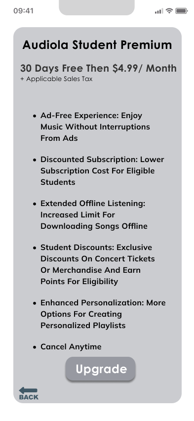
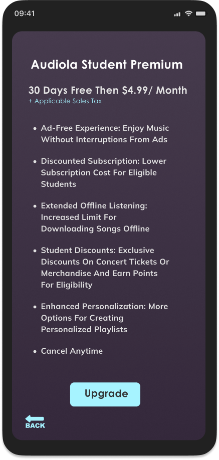
Targeted Special Plans: Introduce exclusive plans for the target audience with higher discounts, bonus features, and the opportunity to earn points for additional rewards or discounts.
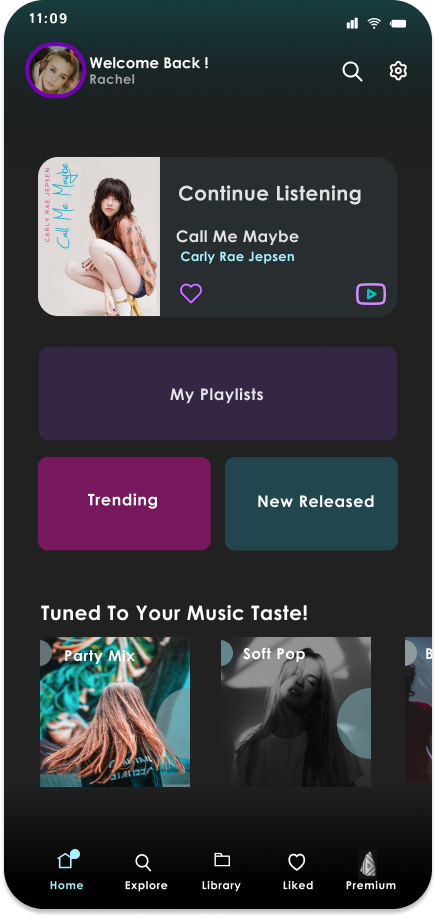
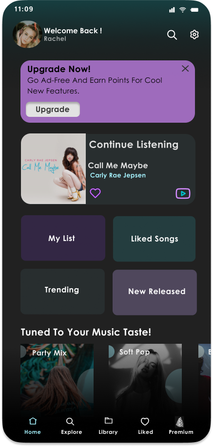
Optimize In-App Placement: Add a call-to-action on the home screen for previous users to easily upgrade to premium.
Premium Icon: Include a premium icon on the bottom navigation bar to make the upgrade option easily accessible.

Design & Iterate

Test & Validate
Study type: In-person usability test
Participants: 4
Length: 20-30 minutes
Repetition: 2 times

